For nearly six years and counting, I’ve had the misfortune of using Microsoft Teams, an infernal piece of software that I am not entirely unconvinced isn’t sadistic psychological research into discovering novel UI/UX anti-patterns.
As I tried my best to use it today for a meeting, I realized that I’d rather tell people I sold crack cocaine or ran a puppy mill than divulge that I’m an engineer at Microsoft who works on Teams.
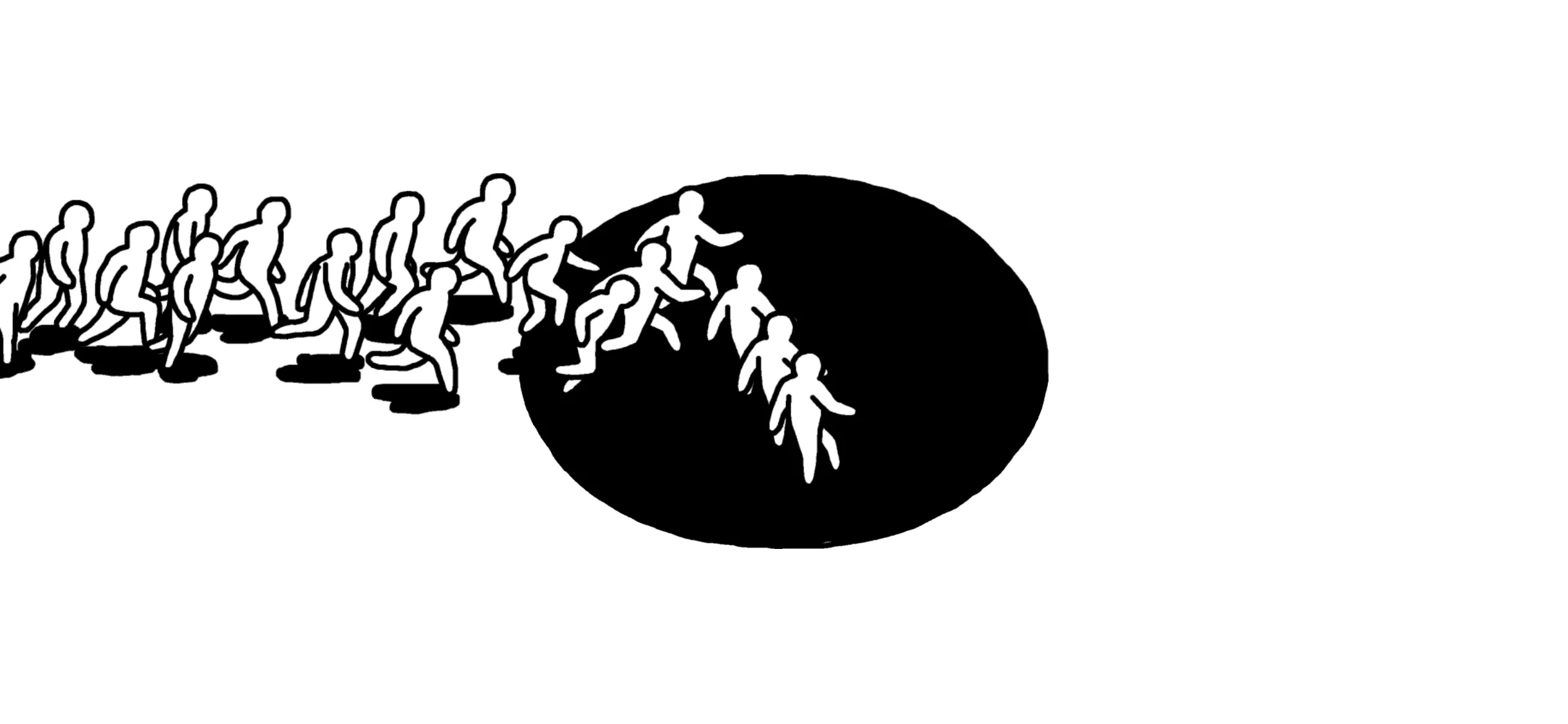
Paul Stiff wrote this inspirational list of dos and don’ts for typographers in 1999. It was written in response to an email circulated by Robin Kinross requesting typographic equivalents for the Dogme 95 injunctions of Danish film-makers.
Readers come first, second, and third. Designing is not do…
My part of the internet is abuzz with the departure of an Apple Exec named Alan Dye who just may be responsible for all the dogshit UI/UX decisions at the company over the last decade or so that heavily favored looks over functionality to a lot of unheeded frustration and dismay. John Gruber offers a fascinating account of his seemingly ill-deserved accession and shittiness as an design leader. Here’s a zinger from the footnotes:
I have good reason to believe that Ive, in private, would be the first person to admit that [he made a mistake promoting Dye]. A fan of Liquid Glass Jony Ive is not. I believe he sees Dye as a graphic designer, not a user interface designer — and not a good graphic designer at that. I don’t think Alan Dye could get a job as a barista at LoveFrom [Ive’s design shop].
The real news is that he is being replaced with Steve Lemay, one of the most OG interaction designers at Apple.
Not someone with a marketing or packaging design background; someone who sweats over pixels and knows what “discoverability” and “affordance” and “feedback” and all those dirty human factors words mean.
I read “iPhone Pocket” and got very excited about the prospect of an updated iPhone Mini (the best phone I’ve used). But lo, a $230 mankini for your fucking phone from a very unserious group of people at Apple:
“Courage” indeed.…
Saving some snippets here but Dave Snyder’s article is worth reading, bookmarking, and meditating over (cached).
Trees don’t pay off tomorrow. They pay off in a decade. They compound quietly, making everything around them better, shade, value, beauty, longevity. Most products? We treat them like…
I would be very dismayed if I spent my creative and professional energies on a half-baked abjectly unnecessary UI and UX abomination that neither adds to nor improves my users’ lives, causes confusion and squinting in many, elicits "meh"s from the rest, and leads to lengthy articles on how to disable my disruptive work so the people I purport to serve can get theirs done.
Quite a few of them are designed to confuse and/or furstrate the user into increasing Shareholder Value™ but there are many that are firmly in “confusion of ideas” territory.
I was completely mesmerized by the poster for the upcoming movie Bugonia, a “satirical absurdist science fiction dark comedy” (Wikipedia). It was designed by Vasilis Marmatakis who collaborates frequently with the movie’s director, Yorgos Lanthimos. The only film I’ve seen (and twice) by the latter…
Via Wikipedia. I am “not able rightly to apprehend the kind of confusion of ideas that could provoke” the genesis of other styles. “Haskell Style” has to be a joke (like this masterpiece) and I just pray I don’t encounter it in the wild1 🙏
// Allman
while (x === y)
{ func1(); func2();
}
// Ho…
Henry Lin has a degree in Architectural Design is a “a lover of all things transportative”. He draws really lovely Car Silhouettes 😍 Here are a few.
Chevy Corvette C3 (1968-1972)
Jaguar E-Type (1961-1968)
Lagonda Rapide (1961 - 1964)
Mercedes-Benz S-Class (W221)
Mercedes-Benz CLS400 (C21…
For “the greatest movie never made”, although there appear to be a few contenders1 for that title, like Stanley Kubrick’s Napoleon.
My absolute favorite is the last one by Hugo Emmanuel Figueroa 🙌
Pe-release flyer (Source)
by Matt Chinn.
Variation 1 by Stan and Vince.
Variation 2 by…
Stephen Crowley is a product designer who maintains @ShitUserStory, my favorite new Twitter account1 (via Deepu). He also maintains a Medium blog with gems like these:
“Can Squid Game make you a better UX designer?” (cached)
“What I’ve learnt about design from parenting a toddler.” (cached)
“Ho…
The Chess Sets used at the World Chess Championships cost $350 (plus $700 if you want the electronic piece tracking), are likely out of stock if you’d like one, take a lot of training and practice to make, are woodworked in Amritsar, India, and were designed by Daniel Weil, a former partner at Pent…
Well… not really. Maybe. Brian Will examines the history of the OOP way of thinking and it’s over-application as a panacea to every problem domain, particularly in The Enterprise™
https://www.youtube.com/watch?v=QM1iUe6IofM…
This week NN Group released a video by Jakob Nielsen in which he attempts to help designers deal with the problem of customers being resistant to their new site/product redesign. The argument goes thusly:
Humans naturally resist change
Your change is for the better
Customers should just get use…
Gone is the gimmicky TouchBar, gone are the four USB-C ports that forced power users to carry a suitcase full of dongles. In their place we get a cornucopia of developer-friendly ports: two USB 3.0 and Thunderbolt 2 ports, a redesigned power connector, and a long-awaited HDMI port.
Photographers…
“Our hip product designers all agree: Adding significant noise via tiny profile pictures allows our users to tell, at a glance, who is online and who isn’t.”
“And no, you cannot opt out. Because fuck you. What’re your options? MatterMost? 🖕😂🖕”…
CK and I loved this short and strange and beautiful ‘game’ by artist Michael Frei and developer Mario van Rickenbach.
There’s even an art exhibition. I don’t know. Take it for what it is.…
Dec 9 It’s so bad a Swiss company made a much saner substitute that sells for ~$20.
Nov 16 Looks like you can use the old remote with the new AppleTV.
I’m annoyed every time I have to use the infernal thing.
It tries (poorly) to be something other than a damn TV remote1.
There’s no way to…
Michael Leggett, lead designer of Gmail from 2008-2012
“It’s like Lucky Charms got spewed all over the screen,” he says to me, as he scrolls through his inbox. It’s true. Folders, contacts, Google apps like Docs and Drive–and at least half a dozen notifications–all clutter Gmail at any given mome…
Can’t Unsee is “Spot the difference” for UI nerds. 6530. On the “hard” sections, wondered how much the minutiae matter if a user is unable to discern the difference between two comps after a few seconds.
Via Deepu…
Roel Nieskens “leveraged the synergy of ligatures” to create a free typeface called Sans Bullshit Sans.
It turns this
The value proposition of our agile mindset and scrum methodology is to enable the emergence of disruptive, convergent, crowdsourced platforms that allow our clients to lean in an…